


A name tattoo is one of the most personal choices you can make: a loved one’s name, initials, your child’s name, a discreet tribute, or a memory you want to carry with you.
But because it’s text, the difference between “ok” and “premium” comes down to details: font, spacing, the right size, and placement so it stays readable over time.
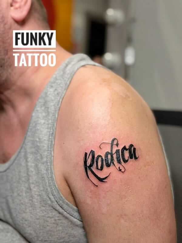
Our recommendation: keep it clean and give the letters room to breathe. If you want ultra-thin lettering, accept that it sometimes needs to be slightly bigger—otherwise it can “close up” after years.
Want a quick estimate? Send the exact text (name) + font/reference + body area + size (cm) + black & grey or colour.
Contact / Appointment | Prices | Tattoo designs (gallery) | Aftercare
If you’re looking for name tattoos in Bucharest, Funky Tattoo is in Piata Romana (Magheru Blvd no. 35).
For consultation and booking: contact page.
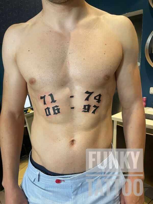
Tip: with text, “too small” is the #1 reason letters stop looking clean over time. Better slightly bigger, with correct spacing, and perfectly readable.
Funky Tattoo is in Piata Romana (Magheru Blvd no. 35). If you want name tattoos in Bucharest, send us the exact text + a font reference + placement + approximate size, and we’ll recommend the version that looks best on your body and stays readable long-term.
Book here: Contact.
Name tattoos don’t really go out of style because the meaning is clear: a person you love, a child, a family bond, a milestone, a tribute.
But because it’s lettering, two things are instantly visible: line quality and readability (font + spacing + size). A premium name tattoo looks clean after healing—not just on day one.
Premium tip
Most requested options for name tattoos:

On the forearm, a name reads extremely well and has a big advantage: it can be expanded later into a larger composition (for example, a sleeve or a design combined with graphic elements).
Premium recommendation: choose a letter height that allows clean spacing—especially for cursive fonts with loops (g, y, f) or brush-style lettering.
Mini FAQ – forearm names
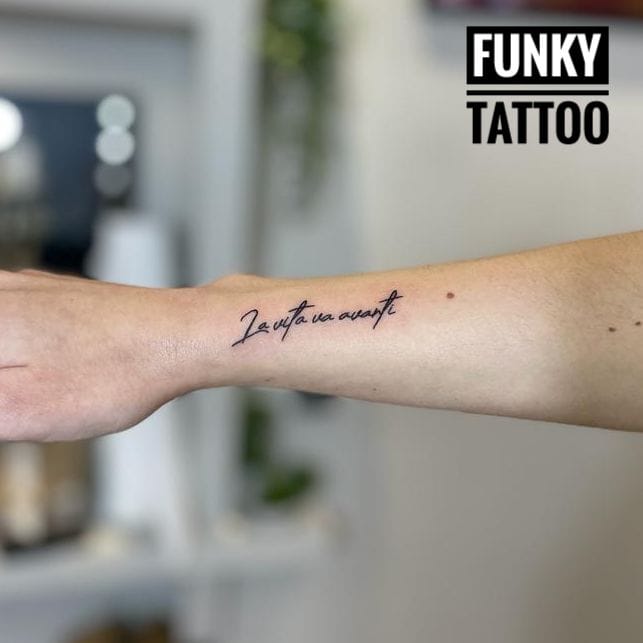
Calligraphy looks “wow” when it’s done properly: thickness variation, rhythm, clean spacing. But it’s a style that doesn’t forgive tiny sizes.
If you want brush calligraphy, choose a size that lets the strokes breathe—otherwise it can become harder to read over time.
Mini FAQ – calligraphy/brush
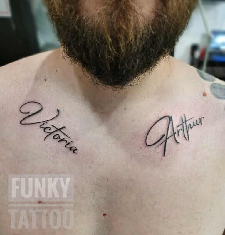
Discreet placements are perfect if you want full control over visibility. The thigh gives you space (premium for lettering + elements), while ribs/collarbone can look very elegant.
Important: on small areas (collarbone, ankle) we keep the text short and the font clean.

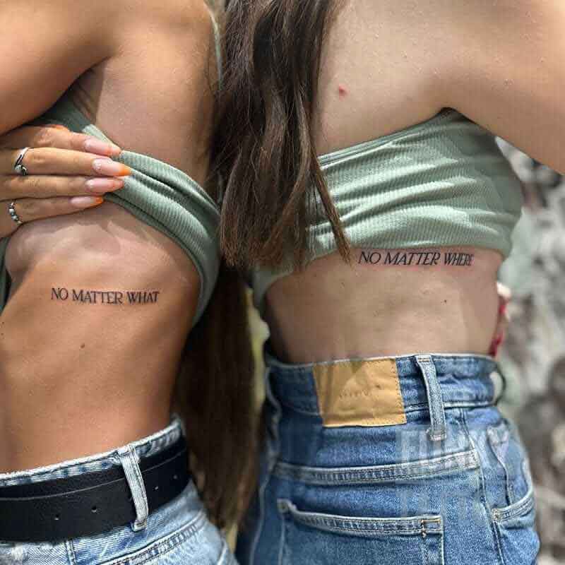
For couples, “premium” means cohesion: same style, same size, matching placement (or complementary), plus a message that actually makes sense for you.
If you want something more “safe”, initials or a shared symbol can be a great choice.
Initials are the smart option if you want something discreet, elegant, and less risky than a full name.
Great directions:
Premium tip
For kids’ names or family, the best-looking versions are usually simple and clean:
For a tribute piece, we recommend a direction that stays elegant:
Premium tip
For name tattoos, “premium” means control on 3 axes:
Simple rules that save you
Yes, it works—but “premium” means not overloading the design.
Combinations that usually look great:
The premium recommendation is simple: think long-term. Relationships can change; tattoos stay.
“Safer” alternatives:
With text, tiny mistakes are the worst kind (because they stay).
Quick checklist:
Pricing depends on font, size, placement and complexity (simple name vs calligraphy + elements). References here:
Prices.
Copy/paste for an estimate:
Text (name/initials): ____
Font (link/reference): ____
Body area: ____
Size (cm): ____
Black & grey / colour / accent colour: ____
Aftercare matters a lot for lettering: clean lines, proper healing, strong contrast. Follow the full guide:
Aftercare.
After healing, protect the area from the sun (especially in summer) to keep the contrast strong.
A readable font with good spacing. During consultation we’ll show options that hold up well for your placement and size.
Yes, but there’s a recommended minimum size. If it’s too small, letters can “close up” over time.
Initials are more discreet and “safe”. A full name has more impact, but needs space and the right font.
Forearm, collarbone, ribs, thigh. We choose based on how visible you want it and how long the text is.
Yes—if you have a clear reference photo. We adapt the linework so it heals clean and stays readable.
Yes, but we keep the composition airy. “Premium” means not overloading it.
We define the exact shapes. Consistency and correctness matter.
It depends on size and style: a simple name is quick; calligraphy + elements can take longer.
Depends on placement. Forearm can be covered with long sleeves; ribs/thigh are naturally more discreet.
Exact text + font/reference + placement + size (cm) + black & grey or colour.