


A neck tattoo is one of the boldest, most “statement” choices: it’s visible, it sets the vibe, and it can look extremely premium when the design is chosen right and the execution is clean.
But because the neck is such an exposed area, more things matter here than on most other placements: size, line quality, placement, and making a realistic decision (work/context, visibility, aftercare).
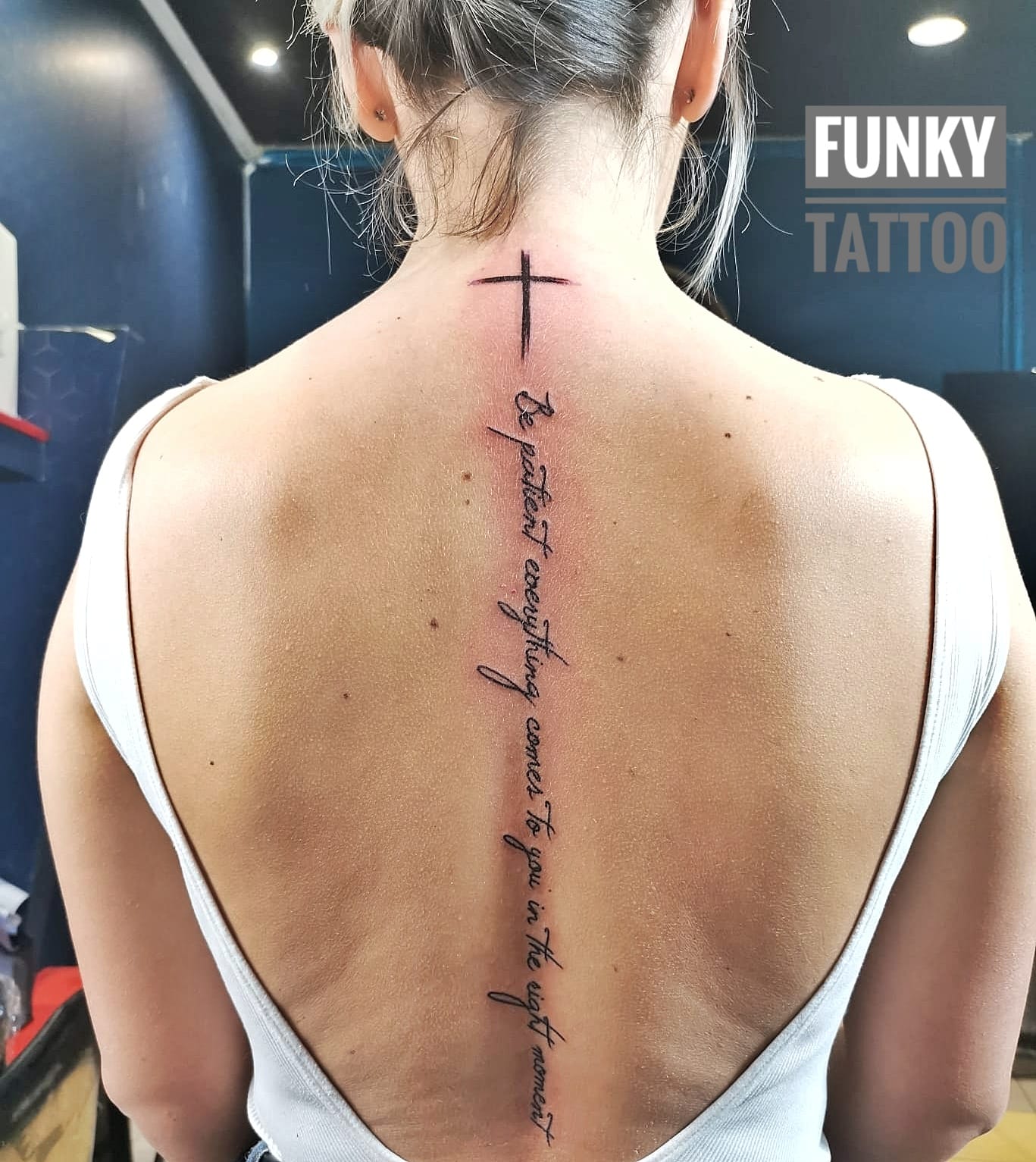
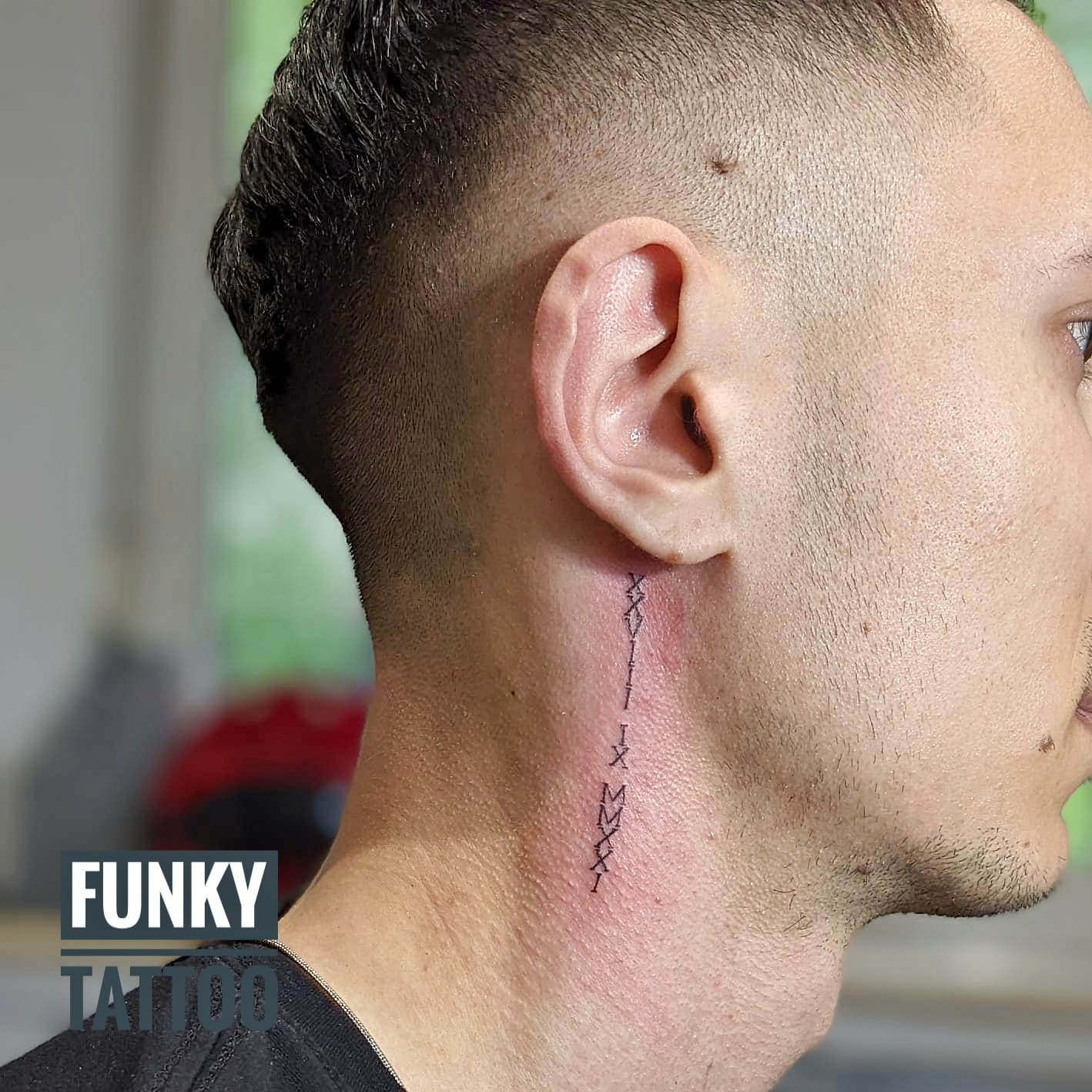
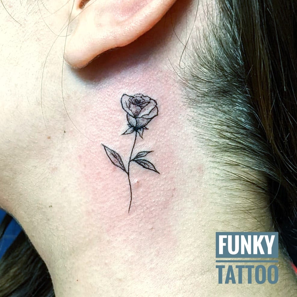
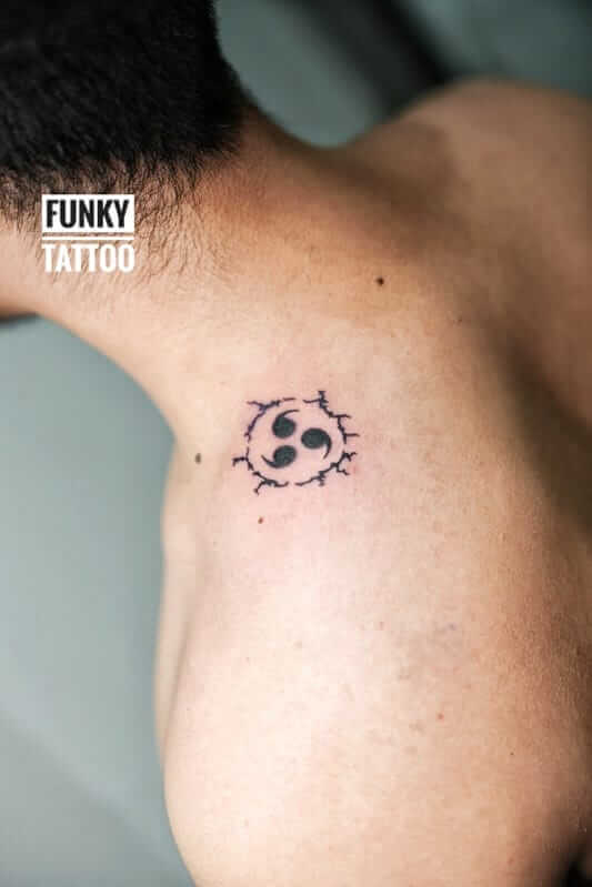
“Neck” isn’t a single spot: the nape (easier to hide when needed), the side (very visible), under/behind the ear (small but noticeable), or the front (the most committed option).
Below you’ll find a full guide + popular ideas with real examples, so you can choose a tattoo that looks great now and years from now.
Want a quick estimate? Send the design (screenshot) + neck placement (nape/side/under ear) + size (cm) + black & grey or colour.
Contact / Appointment | Prices | Tattoo designs (gallery) | Aftercare
If you’re looking for neck tattoos in Bucharest, Funky Tattoo is in Piata Romana (Magheru Blvd no. 35).
For consultation and booking: contact page.
Tip: on the neck, “smaller” isn’t automatically “safer”. Better simple, clean, and well-proportioned than tiny + too fine + hard to read.
Funky Tattoo is in Piata Romana (Magheru Blvd no. 35). For consultation and booking: Contact.
For a quick reply, send: design + exact placement + size (cm) + black & grey/colour.
Neck tattoos deliver instant visual impact—this is the upside. The “serious” part is that the neck is:
That’s why the best neck tattoos are usually clean, simple, high-contrast, and placed correctly for anatomy.
Premium tip
A neck tattoo is a good choice if:
It may not be the best choice if:
Placement changes everything: visibility, shape, and what “holds”.
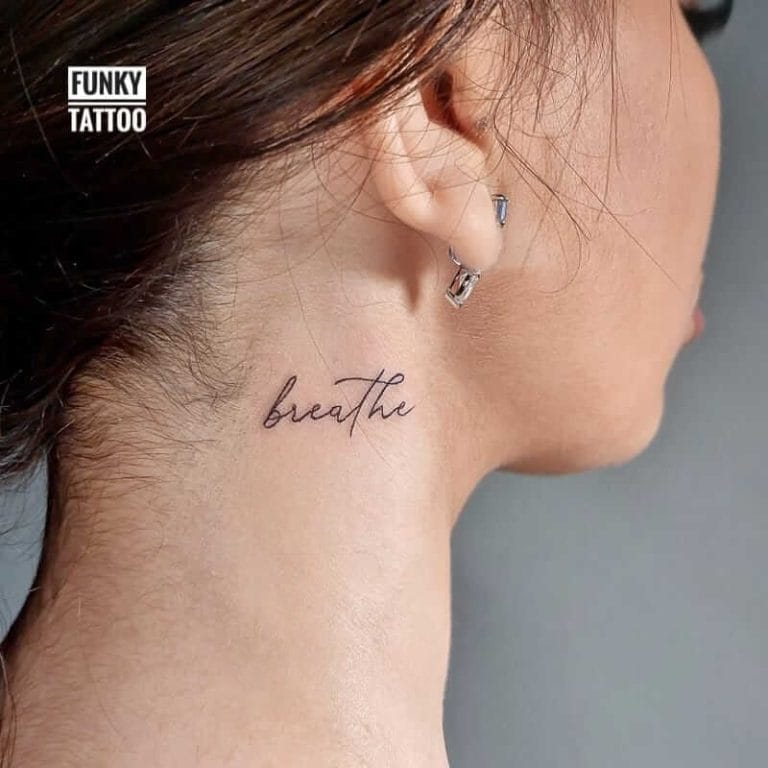
A single word can look super premium when the font is readable and the size isn’t forced. It’s discreet, but still a statement.
For more lettering inspiration: lettering tattoos.
Vertical lettering flows nicely on the side neck when spacing is correct. Recommendation: avoid very long text in ultra-thin fonts.

Behind the ear, the best results come from simple designs: tiny florals, symbols, initials. The area is small—premium means not overloading it.

Tiny florals look great when linework is clean and the design has breathing room. Keep it simple so it stays crisp after healing.

Characters can look super clean on the neck, but meaning matters. Premium recommendation: verify language + meaning before booking.
See: Chinese tattoos.

Small animals/birds can work beautifully on the neck when the silhouette is clear and contrast is strong. Don’t force micro-realism—clean shapes age better.

A dragon/blackwork piece on the side neck has maximum impact. The key is composition—how it flows and how much room we keep for clean lines.
If you want complexity, don’t go too small.
On the neck, the rule is simple: clarity > complexity.
Premium tip
The realistic part: a neck tattoo can affect your image in formal contexts.
If you need discretion, safer alternatives include:
If you still want side neck, keep it clean so it looks good even when partially visible.
Pain tolerance varies, but generally:
Neck aftercare has a few specifics:
Cover-ups on the neck are possible in some cases, but space and visibility are limiting factors.
Laser removal can be long and expensive, so plan the design right from the start.
Conclusion: on the neck, simple and safe beats complex and regretful.
Price depends on size, complexity, style, and black & grey vs colour. References:
Prices.
Copy/paste for an estimate:
Design (link/screenshot): ____
Neck placement (nape/side/under ear): ____
Size (cm): ____
Black & grey / colour / accent colour: ____
We usually recommend starting with a less exposed area. If you want the neck, the nape is often the safer option.
Nape is easier to hide; side neck is much more visible and needs a very clean design.
Simple symbols, clean blackwork, ornamental with space, fine line with correct size, short lettering with readable font.
Not automatically, but because it’s exposed (sun + friction), aftercare and sun protection matter a lot.
Depends on size and complexity: a small symbol is quick; larger compositions can take sessions.
A screenshot + exact placement + size (cm) + black & grey or colour.